Creating a Visual Impression of a Garden
Helen Shafer Garcia captured the Mission Hills Garden Club members’ attention at the February 29 meeting. She is an artist, illustrator, teacher, gardener, and public speaker.
Shafer Garcia’s diverse activities have included translating professional landscapers’ rough diagrams into a visual impression of what the garden will be when complete. In addition to helping clients visualize, she has used this technique to illustrate brochures, and magazines advertising many resorts. When she works with clients, she deliberately distorts the perspective to convey which plants lie behind plants that hide them. She paints her watercolor garden-scheme illustrations as if she stood simultaneously on the ground and on a perch several feet above the garden.
Shafer Garcia created illustrations for San Diego Home/Garden Lifestyles Magazines for nine years. On a whim, in 1987 she entered her own garden in one of the magazine’s contests and won. Shafer Garcia’s garden features succulents, perennials, one fruit tree, numerous full-grown oaks and a host of vegetables, and it provides inspiration for her paintings.
Shafer Garcia often begins with a light lead pencil sketch. She sometimes defines edges with a colored pencil, and occasionally she even uses pen and ink. Shafer Garcia explained that while color, line, and texture are important, so is negative space. Greys can be difficult.
She continued by explaining what she uses for her paper. Arches 140 IB paper is a good choice because it absorbs the paint well. Shafer Garcia gave us some good advice: Buy synthetic brushes; they are hardier. Use lots of water. Do NOT eat cookies when painting! The oil from even one crumb leaves a stain on the paper, which you either must camouflage by turning it into an object (even if it should not be there). Collages can sometimes cover big mistakes.
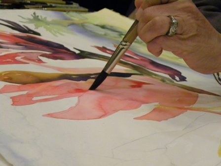
When she paints, she goes from warm colors to cool. Beginning with dry paper, she paints the edge of the shape with a warm color and plenty of water. The paint will run, and she watches it. She does not believe in blotting the paper, and she paints on a horizontal surface to prevent water and paint from dripping down the page. The combination of the paper and the horizontal surface help keep the paint where it should be. When Shafer Garcia adds a second color to the shape, she allows it to flow into the first color, blurring the demarcation of the two colors. Being aware of the light source is important for creating depth. Adding a third color creates the illusion of depth. To grey the shaded area she may use the exact opposite color* along the shaded side of the object, again allowing the paint to bleed into the previous color. The lightest color you can use is none. Shafer Garcia saves the paper’s whiteness for highlights, where the light hits the object directly. You can always add more paint, but you cannot add more blank paper.
Flooding an area is another technique she uses. This causes the pigments to run to the edges of the shapes. How much water and how much paint to use is a matter of experience. Shafer Garcia has done enough painting that I suspect she is rarely surprised by what happens on her paper. She often uses drops of water on a color to create blooms or round pale centers spreading darker pigment outward, giving added texture to an object. Each pigment has its own “spreading rate.” Again, experience will teach you which dry quickly and which will flood more easily or remain damp enough to continue working.
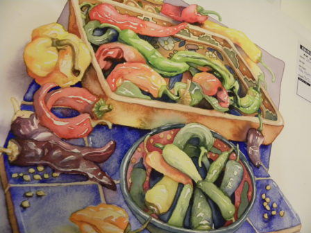
We had a chance to handle and examine her work closely. She told us about several of the paintings. Having created numerous vegetable and fruit illustrations, she told us that chiles “nearly did me in.” Garlic was another “tough one,” she confessed. “All that white.”
“How long does it take to do a painting?” an audience member asked. Shafer Garcia says a painting can take six to eight hours. However, her studio is at home, and since she uses “tons of water,” she can unload the dishwasher, do a load of laundry, go out and weed, or do something to allow her to move about and to wait for the paint to settle into the paper.
Shafer Garcia made me want to tackle watercolor again. I had never enjoyed it because either the paper was soggy or streaks kept running down the page. After narrowly missing a D in my watercolor class, I happily switched to oils and acrylics, neither of which is drippy. Helen’s way seems to control the paint’s running amok. Now all I need is time.
Scott Northcote is the featured speaker of the April 25, 2012 meeting to be held from 6 to 9 p.m. at Botanica, 2355 India Street. If you become lost, call 619 294-3100. Members are free; guests pay $10.00.
*A color wheel will show you the opposite color: purple is across from yellow, for example; orange is opposite blue; red’s opposite is green.
Category: Life Style


